
Checkout Conversion: Make Buying Easier for Customers
Improve online store checkout conversion with practical steps for clearer costs, shorter forms, mobile usability, trustworthy payment details, and reliable testing.
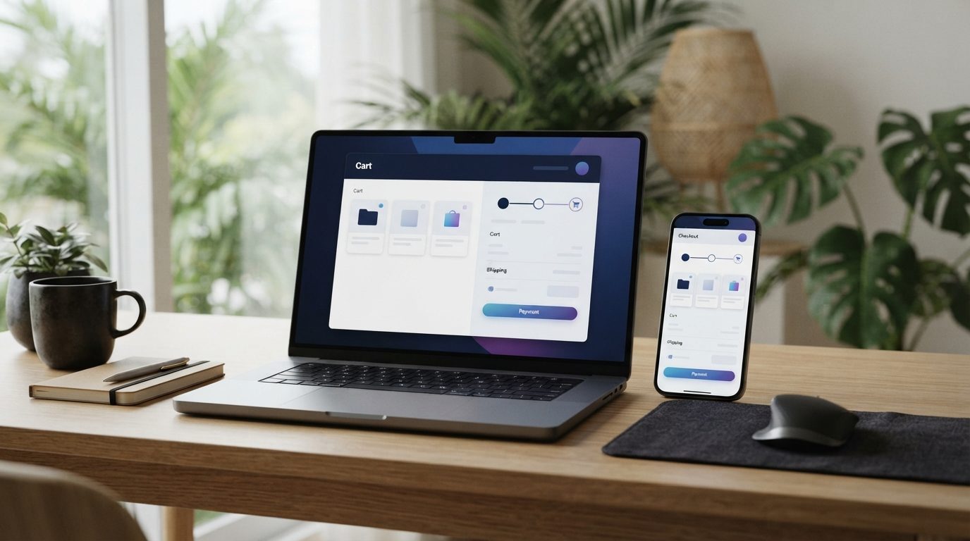
A smoother online store checkout helps customers understand what they are buying, what they will pay, and how to finish an order. To improve checkout conversion, remove unnecessary steps, show delivery and payment details early, and test the full process on a phone before making changes.
Key takeaways
- Make guest checkout easy to find and avoid demanding an account before purchase.
- Show shipping costs, delivery estimates, and accepted payment methods before the final step.
- Ask only for information needed to fulfil the order.
- Use clear field labels and helpful error messages.
- Test real orders on mobile, including payment and confirmation.
Why online store checkout conversion depends on clarity
People can leave checkout when a step feels confusing, costly, or unexpectedly difficult. A visitor may be ready to buy, but hesitate if shipping appears late, a form rejects a familiar address, or the site asks for account details without explanation.
Checkout conversion is the share of checkout visits that become completed orders. It is useful to track, but it does not tell you why customers stop. Pair the number with customer feedback and a hands-on review of the buying process.
Baymard Institute’s checkout research points to the checkout flow as a frequent source of purchase friction. Its recommendations include reducing needless account barriers and making delivery information clear. Treat those findings as guidance, not a promise of a specific result for your store.
Map the checkout before changing it
Start by placing an order on your own site. Use a phone and a desktop computer. If possible, ask someone unfamiliar with your store to complete a test order while explaining what they expect at each step.
Write down every point where they pause, ask a question, or make a mistake. Check product selection, cart review, address entry, delivery choices, payment, and the order confirmation. Keep a test checklist so you can repeat the same journey after updates.
Record the main steps and questions
At each step, ask: Is the next action obvious? Are costs visible? Can the customer correct a mistake? Does the page explain what happens after the button is clicked?
Review your analytics alongside these observations. If you already track checkout events, see where the journey loses activity. Event tracking can help locate a problem, but it cannot explain the customer’s reason by itself. For more on measuring enquiries and outcomes, see this guide to tracking leads in GA4.
Show the total cost and delivery details early
Customers need enough information to decide whether an order works for them. Show the item price, delivery charge, taxes or other applicable fees, and the order total before asking them to pay. If the final delivery cost depends on location, explain when and how it will be calculated.
Give a realistic delivery estimate where you can support one. A clear date or date range is more useful than a vague label such as “standard shipping.” Be careful not to promise a delivery time your fulfilment process cannot meet.
For Philippine stores, explain relevant local options in plain language. State whether delivery is available in the buyer’s area, how shipping is calculated, and what payment methods the store accepts. Do not display payment options that are unavailable for the customer’s order or location.
Reduce form work without losing needed information
Every form field asks the customer to do more work. Remove fields that are not needed to accept, process, or deliver the order. If a field is optional, label it optional. If it is required, make that clear before the customer submits the form.
Make guest checkout a real option
Let shoppers place an order without creating an account. If an account would help with future orders, offer account creation after the purchase or explain its benefit without making it a condition of payment.
Returning customers may appreciate sign-in, but it should not block someone who wants to buy once. Keep account recovery simple, and avoid making a forgotten password an obstacle to completing a current order.
Use clear labels and useful error messages
Keep field labels visible while customers type. Do not rely only on placeholder text, which can disappear once a field is filled. Use familiar terms for names, contact details, and address information.
When a field has an error, explain what needs fixing near that field. Preserve information the customer entered correctly, and avoid clearing the entire form after a small mistake. Where possible, support browser autofill and sensible address formatting.
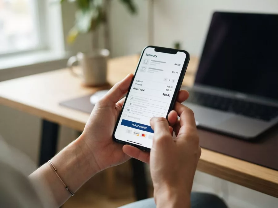
Make mobile checkout comfortable and predictable
Many customers shop on a phone, where small controls and long forms are harder to use. Check that text is readable, buttons are easy to tap, and the page does not require sideways scrolling. Keep the main action easy to find without hiding important costs or choices.
Use the appropriate input type for each field, such as a numeric keypad for a phone number when supported. Keep the number of fields visible manageable, and group related information logically. If checkout has multiple steps, label them and show progress in a way that remains clear on a small screen.
Review how the site behaves when a payment provider opens, returns, or takes extra time. Customers should know whether their payment is processing and whether they need to act again. Avoid placing unnecessary distractions between the customer and order completion.
Build trust with transparent payment and order information
Trust comes from clear, consistent information, not a pile of badges. Explain available payment methods and show the final amount before the customer commits. Provide links to policies that answer common questions, such as returns, shipping, and privacy.
Make the final order review useful. Let customers confirm their items, delivery details, and total. If they need to edit something, provide a clear way to return to the relevant section without losing their progress.
After payment, show a confirmation page and send an order confirmation email. State whether the order was received and what happens next. If payment is still pending, say so directly rather than implying that the order is complete.
If you are planning a broader store build or redesign, explore e-commerce development. A well-designed buying journey also depends on the wider website design and development, not only the payment page.
Test improvements and keep checkout reliable
Change one clear problem at a time where practical. For example, you might clarify shipping costs before redesigning the entire checkout. Check whether the change helps customers complete orders without causing a new issue elsewhere.
Test the complete journey after changes to themes, plugins, payment settings, or delivery rules. Use test transactions when your payment provider supports them. Confirm that order details appear correctly in the store, that notifications arrive, and that the customer sees a clear result.
Keep a record of what changed and when. Compare relevant checkout steps over a useful period, while remembering that traffic, product demand, and promotions can affect results. Avoid treating a short-term movement as proof that one design change caused it.
For ongoing technical checks, consider website maintenance and technical support. For authoritative usability guidance, review Baymard Institute’s checkout usability research.
Frequently asked questions
What is checkout conversion?
It is the proportion of checkout visits that result in completed orders. Track it with other measures and customer feedback to understand where buyers may be getting stuck.
Should an online store require customers to create an account?
Usually, offer guest checkout. Customers can decide whether to create an account after buying, when the benefit is clearer and the order is already placed.
What should appear before a customer pays?
Show the items, order total, delivery details, payment choices, and any important terms. Customers should be able to review and correct key information.
How can I test checkout on mobile?
Place a test order on a real phone if possible. Check form entry, buttons, payment handoff, loading feedback, and the confirmation message.
Make your next checkout improvement
Begin with one real customer journey and fix the clearest source of friction. Keep costs and delivery details visible, make forms easier, and test every important path after updates. If your store needs a more focused review or improvement plan, contact Herby Design.
Found this helpful? Share it
Want more checkout completions? Make buying easier with clearer costs, shorter forms, mobile-friendly steps, and trustworthy payment details.#Ecommerce #CheckoutOptimization #UserExperience #SmallBusiness #WebDesign
Caption and hashtags copied: paste them into your post.
Need help with your website?
I build fast, SEO-ready websites and web applications.